In today’s digital landscape, where mobile usage continues to soar, optimizing websites for mobile devices has become imperative. Mobile SEO focuses on enhancing the visibility of websites on mobile search engines, ultimately improving the user experience for mobile users.
Table of contents
- Mobile SEO Best Practices
- Responsive Design and Mobile-Friendly Content
- Techniques for Creating Mobile-Friendly Content
- Benefits for Mobile SEO
- Optimizing Local SEO
- How to Prepare for Mobile-First Indexing
- Best Practices for Formatting Content on Mobile Devices
- Tips for Optimizing Site Navigation for Mobile Users
- Conclusion
Mobile SEO Best Practices
With the majority of internet traffic originating from mobile devices, ensuring that your website is optimized for mobile is crucial for reaching and engaging your target audience. Mobile optimization improves search engine rankings and user experience too. Leading to higher conversion rates and customer satisfaction.
Responsive Design and Mobile-Friendly Content

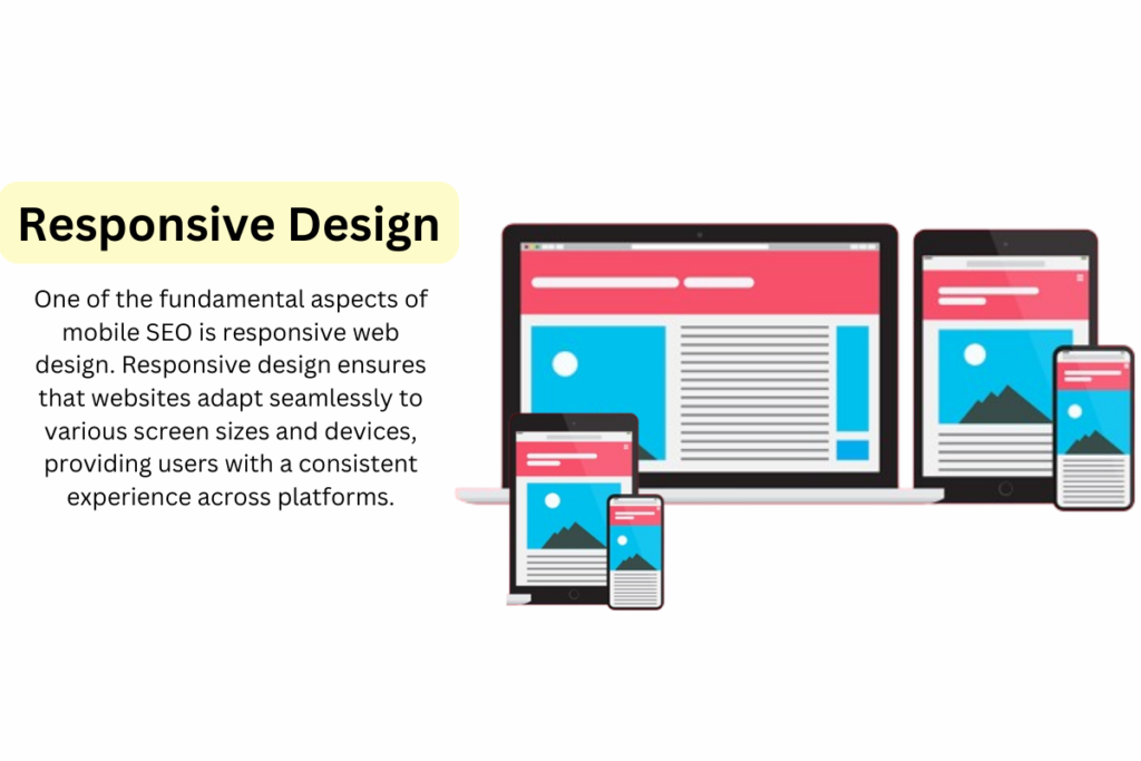
One of the fundamental aspects of mobile SEO is responsive web design. Responsive design ensures that websites adapt seamlessly to various screen sizes and devices, providing users with a consistent experience across platforms.
Techniques for Creating Mobile-Friendly Content
Creating content for mobile devices should be concise, engaging, and easy to digest for user. Utilize short sentences, bullet points, and headings to break up content and improve readability on smaller screens.

| Technique | Explanation |
| Utilize Responsive Design | Responsive design adapts your website to all screen sizes, including mobile devices, using flexible grids, CSS media queries, and fluid images. It enhances user experience by ensuring content looks good and functions well across devices. |
| Prioritize Content Hierarchy | Mobile screens have limited space, so it’s crucial to prioritize content hierarchy. Place the most important information at the top and use clear headings, subheadings, and visual cues to guide users through the content. By organizing content effectively, you make it easier for users to find what they’re looking for without having to scroll excessively. |
| Optimize Touchscreen Interactions | Mobile users interact with devices primarily through touchscreens, so optimizing touchscreen interactions is essential. Ensure that buttons and links are large enough to tap easily, provide ample spacing between interactive elements to prevent accidental taps, and use intuitive gestures for navigation. By optimizing touchscreen interactions, you enhance usability on mobile devices. |
| Minimize Text Entry Requirements | Typing on mobile devices can be cumbersome, so minimize text entry requirements whenever possible. Use dropdown menus, checkboxes, and pre-filled forms to reduce the need for users to input text manually. Additionally, utilize predictive text and auto-correct features to streamline the input process and minimize user frustration. |
| Implement Accelerated Mobile Pages (AMP) | Accelerated Mobile Pages (AMP) is an open-source initiative that aims to improve the performance of web content on mobile devices. By implementing AMP, you can create lightweight, fast-loading versions of your web pages optimized for mobile. This improves page load times, reduces bounce rates, and enhances the overall mobile user experience, contributing to better mobile SEO rankings. |
Benefits for Mobile SEO
By incorporating structured data markup, you can enable rich snippets. Which enhance the appearance of your listings in search results, making them more visually appealing and informative for mobile users.

- Enhanced Visibility: Structured data markup increases the likelihood of your website appearing in rich snippets, which occupy more space in search engine results pages (SERPs), boosting your visibility among mobile users.
- Improved Click-Through Rates (CTRs): Rich snippets provide users with more information upfront, enticing them to click on your website over others, ultimately increasing CTRs and driving more traffic.
- Better User Experience (UX): Rich snippets provide a visually appealing and informative preview of your content, aiding mobile users in quickly assessing if your page meets their needs, thereby enhancing UX.
- Competitive Advantage: Implemented effectively, structured data markup can distinguish your listings from competitors. On mobile devices with limited space, it provides a competitive edge in SERPs.
- Higher Conversions: With increased visibility, improved CTRs, and enhanced UX, structured data markup can lead to higher conversion rates as more mobile users engage with and convert on your website.
Optimizing Local SEO
Claiming your Google My Business listing, optimizing local keywords. And encouraging customer reviews are essential tactics for improving local SEO and attracting mobile users in your area.

How to Prepare for Mobile-First Indexing
Ensure that your website is mobile-responsive, prioritize mobile usability. And focus on delivering high-quality content and user experience across all devices to adapt to Google’s mobile-first indexing algorithm.
Best Practices for Formatting Content on Mobile Devices
Use legible fonts, maintain sufficient spacing between elements. And avoid large blocks of text to make content more scannable and user-friendly on mobile screens. Intuitive navigation is crucial for keeping mobile users engaged and helping them find the information they need quickly and easily. Simplify menu structures, prioritize important content, and implement clear calls-to-action to improve site navigation on mobile devices.
Tips for Optimizing Site Navigation for Mobile Users
Utilize hamburger menus, implement sticky navigation bars. And provide breadcrumb trails to enhance navigation efficiency and user experience on mobile websites.
- Sticky Navigation Bars: Sticky navigation bars remain visible at the top or bottom of the screen. Even users scrolling down the pag. This ensures that important navigation options are always easily accessible. Eliminating the need for users to scroll back to the top of the page to navigate elsewhere. Sticky navigation bars enhance user productivity and comfort on lengthy pages that require extensive scrolling.
- Breadcrumb Trails: Breadcrumb trails are a navigational aid that shows users their current location within the website’s hierarchy . And provides clickable links to higher-level pages. They typically appear as a series of links separated by arrows or slashes. Reflecting the path users have taken to arrive at their current page. Breadcrumb trails help users understand the structure of the website. And navigate back to higher-level categories or pages without losing context. On mobile devices, where screen space is limited. Breadcrumb trails can be collapsed into a compact form to optimize usability without sacrificing functionality.
Conclusion
As today’s digital era, optimizing websites for mobile devices is essential for success. Mobile SEO focuses on enhancing visibility and providing an exceptional user experience on mobile platforms. Ultimately leading to higher engagement, conversions, and customer satisfaction.
FAQs
Mobile optimization is crucial for SEO, as the majority of internet users access the web through mobile devices.
Responsive design ensures that websites adapt seamlessly to various screen sizes and devices, providing a consistent user experience.
Site speed is critical for mobile SEO, mobile users want fast-loading websites. Slow loading times can lead to higher bounce rates and decreased user satisfaction, negatively impacting SEO rankings.
Structured data markup enables rich snippets in search engine results, enhancing visibility and attracting more clicks from mobile users. Rich snippets provide additional information upfront, making listings more compelling and informative.


